Colour psychology is acknowledged to greatly impact the way people react and make decisions. When it comes to offices buildings, the styles and types of colours adopted do not only serve as aesthetical determinants but, likewise, directs and influences moods of both the staff who work within and the clients who come to accomplish their commercial ends. Consequently, it is imperative to consider your interior and exterior office colour choices as being integral to your business goals and accomplishments. Unlike personal and private spheres, first impression counts greater with business. The extra wall details can go a long way to foster better business opportunities. This is why we carefully put together 5 major commercial building painting ideas that, depending on your business line, can help foster an insight into what is the most appropriate painting choice for your office premises.
- Bright Colours: Red, Yellow and Orange
Bright colours such as Red, Yellow and Orange are associated with vibrancyand energy. In a commercial sphere, the colours are more likely to attract attention and spring up emotions. Hence, it is a great colour choice forboth interior and exterior commercial spaces. However, it might not be an automatically fits for all commercial buildings.
As confirmed by psychologist, red, for instance, increases the intensity and speed of human emotions. The urgency and anxiety it commands may, therefore, not be appropriate for some productive offices. Red is ideal for construction industry to stimulate the energy level. A touch of red may likewise be very good for retail and sales firm.Yellow and orange has the ability to spur up emotive energy. Hence, they are great alternatives for the creative industries.
Nonetheless, when you need to combine colours, red goes better with green, just as yellow combines better with purple and orange with blue colour.
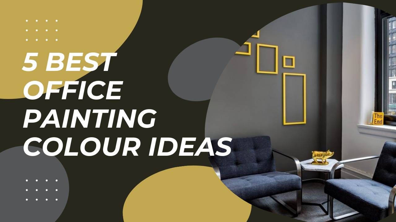
- Neutral Colours I: White and Black
Using white colour on commercial building need certain understanding and creativity. White has the potential to be both slick and bland. Researches have often confirmed that white has a clinical appeal which can make people feel unwelcome or intimidated. However, it could be the best choice for hospitality facilities to evoke the feeling of care and cleanliness. Creatively, combining other shades and colours can be doneon the walkways, driveways or landscaping design decor.
Black, on the other hand can be used to paint high-ended retail stores. This works well when combined with gold colour.
- Neutral colour II: Grey, Brown and Off-White
Grey is a slick neutral colour that falls between white and black. The different hues of grey evoke varying psyches. Some are very subtle and could induce melancholic feelings– like the classic grey, while others have a clinical effect – like off-white grey hues. These are rather softer office paint colours than actual white and ideal to create a warm and clean business environment. Grey combines perfectly with blue.
Brown, as a neutral colour, in addition to warmth, commands a feeling of strength and power. Hence, brown is often considered a masculine colour and ideal for sport settings.
Generally, neutral colours are a safe choice for big commercial building, especially, one that houses several departmental stores.
- Cold Colours: Blue and Green
Blue is a very good interior and exterior colour for commercial premises. To colour psychologist, it stimulates the mind. Blue also portrays an inviting feeling. The colour blue is therefore very popular with accounting offices to conjure spirited focus and increase productivity. Light hues of blue can also appear quite calming and foster peaceful vibes. Hence, this is a great choice for resting areas and medical spheres.It arouses a sense of reassurance in places where tensions are usually high. Blue combines well with grey, brown and most neutral colours
Similarly, green colour foster a sense of success and growth. It is no-brainer green is the colour of money. It helps to create emotional balance and feelings of calmness. Financial industries and healthcare buildings are best painted green.
- Purple and it Many Shades
Purple is often considered as a feminine colour that depicts beauty, opulence and fantasy. The many hues of purple can help portray calmness with a regal vibe. That is why purple is also associated with power and royalty. It is commonly used to paint commercial building like salons, beauty shops, boutiques, perfume store, bars, nightclubs and hospitality centres.
Get in Touch
We have put this together to help you save effort and time deciding on the appropriate colour for your commercial building space. We acknowledge that paint colour choice may,likewise,be influenced by other extra factors like brand colours and local or environmental laws. We therefore advise that you consult professionals to help you decide appropriately on the best colour and colour combinations choices to adopt for your interior and exterior spaces.